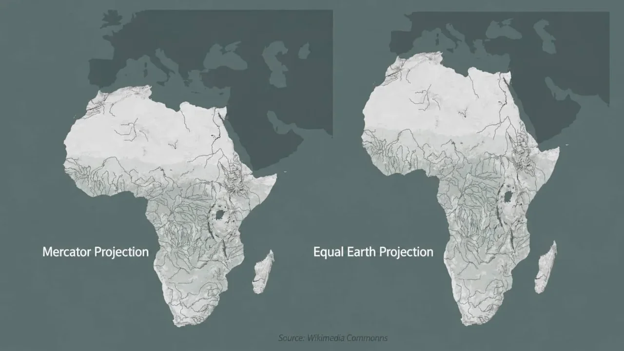
The United Nations has supported the Equal Earth projection, a world map designed to show continents and countries in proportions that are closer to reality. The move highlights a long-running debate in cartography: every flat map distorts the round Earth, but some projections create far less visual imbalance than others.
Why this map matters
The widely used Mercator projection remains practical for navigation, yet it enlarges regions near the poles and can make Africa appear far smaller than it is. Equal Earth reduces those distortions, offering a more balanced view for classrooms, public communication, and global analysis.
Cartographers note that no single projection is perfect for every purpose. The choice depends on the task: navigation, education, or data storytelling. In that sense, the UN's endorsement is less about replacing every map and more about encouraging a more accurate visual language for the planet.
From classrooms to global conversations
The projection, introduced in 2018, has already gained traction among mapmakers and is now available in wall maps and media formats. Supporters say it can help audiences compare regions more clearly and better understand global patterns in population, environment, and development.
The discussion also reflects a broader idea often described as cognitive justice: the way a map looks can shape how people perceive scale, importance, and influence. By making Africa appear closer to its true size, Equal Earth may help reset those perceptions in education and international dialogue.
As more institutions explore alternative projections, the future of mapping may become more precise, more inclusive, and more aligned with how the world actually looks.