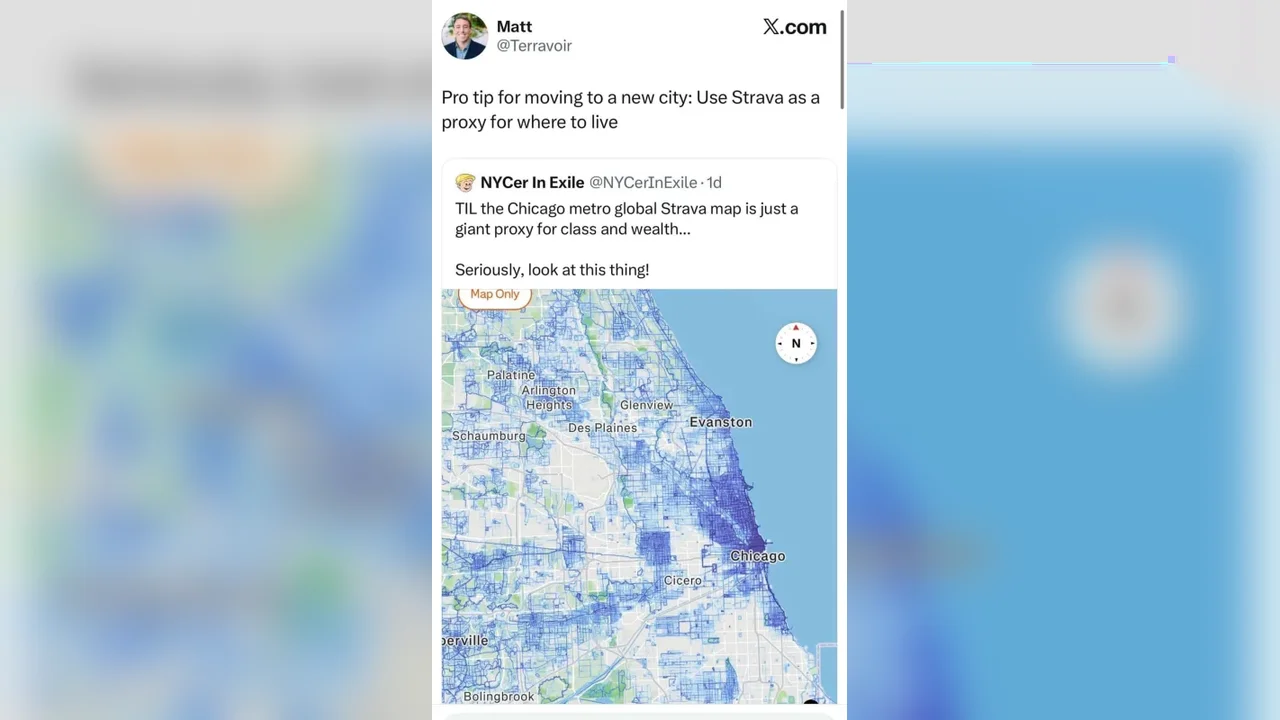
Strava's global heatmap, originally designed to help runners and cyclists discover routes, is now being read in a new way: as a digital snapshot of where people most enjoy spending time in a city.
What began as a fitness tool has evolved into a broader lens on urban life. The glowing trails on the map often align with parks, bike lanes, walkable streets, and neighborhoods where outdoor movement feels easy and appealing. In that sense, the data can reveal more than exercise habits; it can also hint at the quality of public space and everyday comfort.
A map shaped by movement
Strava has built a distinctive culture around recorded activity, from kudos to route segments and local leaderboards. With more than 200 million users, the platform turns millions of runs, rides, walks, and hikes into a layered visual map of movement.
That map is increasingly being used as an informal urban signal. In cities such as Chicago, Bengaluru, and Baltimore, users have noticed that the brightest areas often overlap with neighborhoods that are easier to navigate on foot or by bike. Researchers have also found that runners tend to favor streets that feel open, clean, accessible, and connected to natural features.
Still, the heatmap is not a full portrait of a city. It reflects a self-selected group of users, many of whom are younger, more active, and more likely to track their workouts. That makes the data useful, but also selective. For planners and curious newcomers, the value lies in reading it as one layer among many.
As cities continue to blend mobility, wellness, and digital mapping, tools like Strava may offer fresh clues about how people experience urban space. In the future, this kind of data could help shape more walkable, livable, and human-centered neighborhoods.