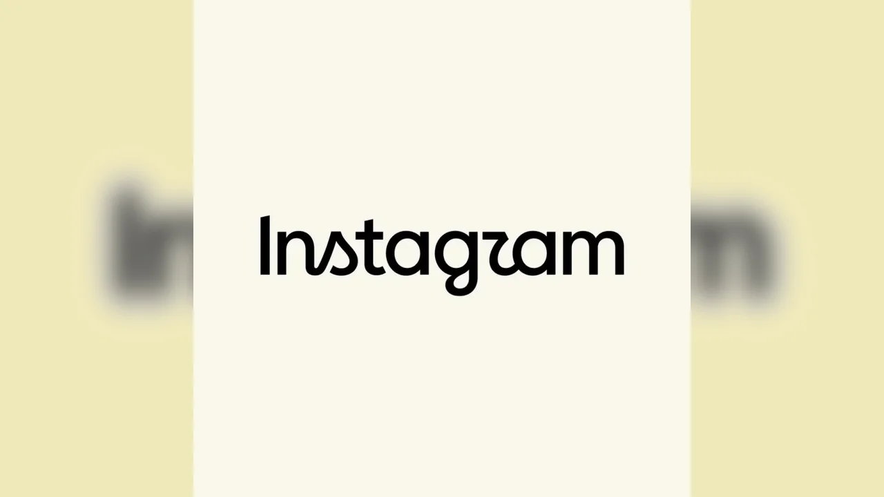
Instagram has unveiled a redesigned wordmark, updating the text-only version of its logo with a sharper, more contemporary style. The company says the new look keeps the brand's familiar identity while giving it a fresher visual rhythm.
Head of Instagram Adam Mosseri shared the update across Instagram and Threads, describing the revised lettering as more modern while still staying close to the platform's original character. The redesign reflects a broader trend in digital branding, where even subtle typography changes can signal evolution.
Reactions have been mixed but largely curious, with many users noting the cleaner appearance and the distinct font details. The new lettering includes curved, cursive-inspired shapes that give the brand a more expressive feel, especially in the "s," "r," and "g."
This is Instagram's first notable wordmark update since 2016, when the platform introduced its colorful gradient icon. While Meta has not indicated whether more design changes are coming, the refresh shows how major platforms continue to refine their visual language to stay aligned with changing digital tastes.
As online identities become increasingly design-driven, this kind of update may shape how future platforms balance recognition, simplicity, and style.